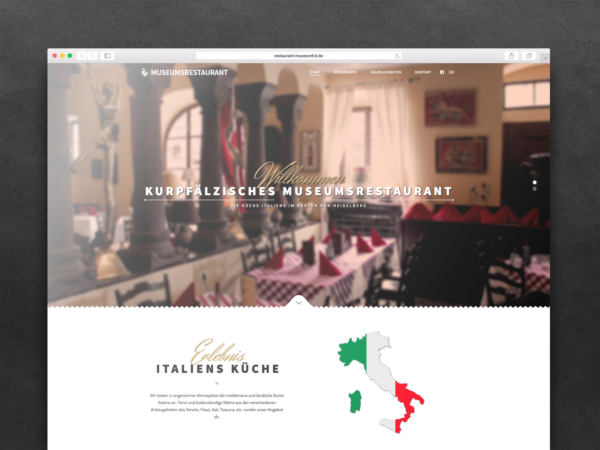
The Kurpfälzisches Museum (Palatinate Museum) is a museum of art and archaeology in Heidelberg, Germany. It is located in the Palais Morass.
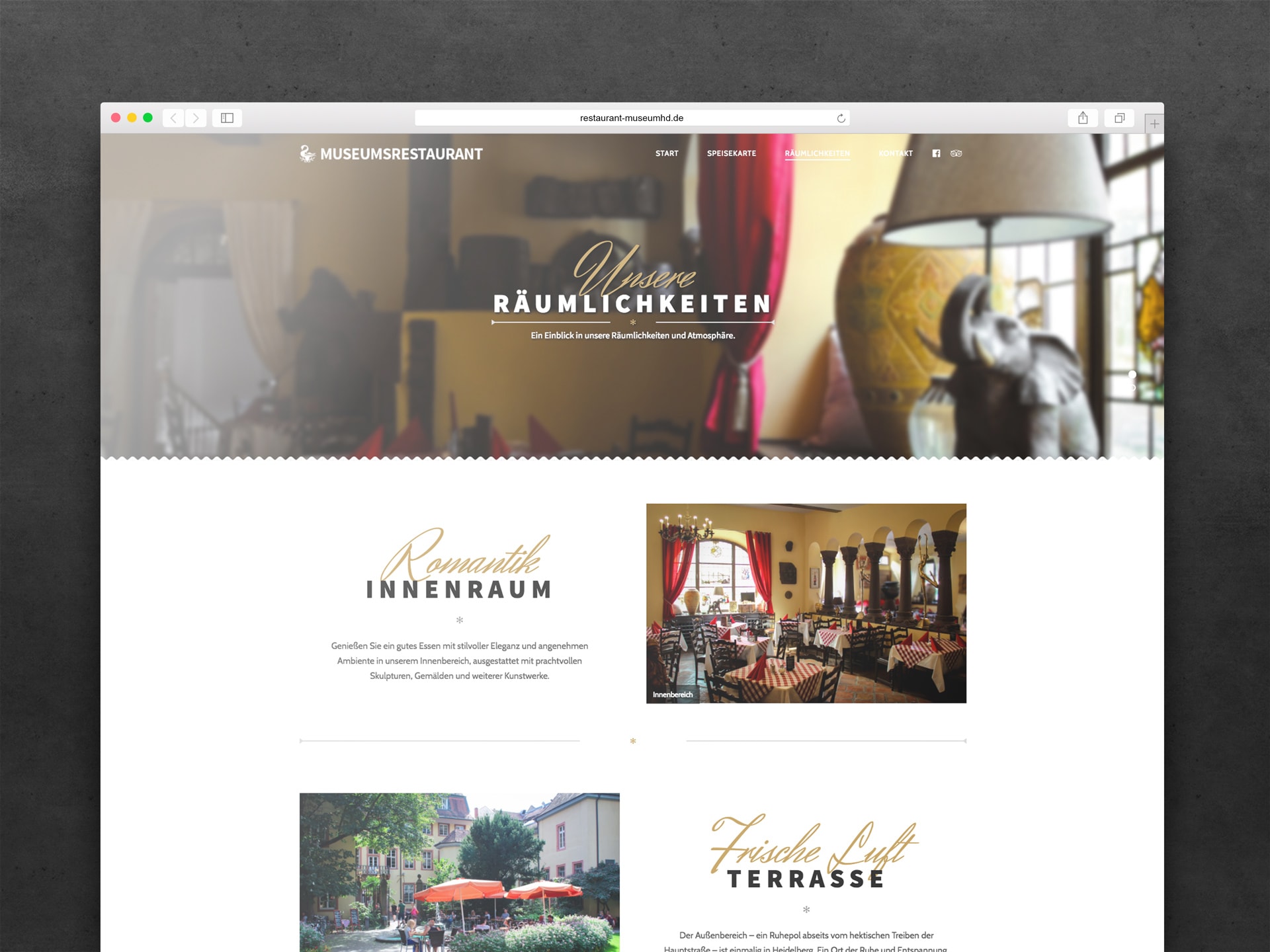
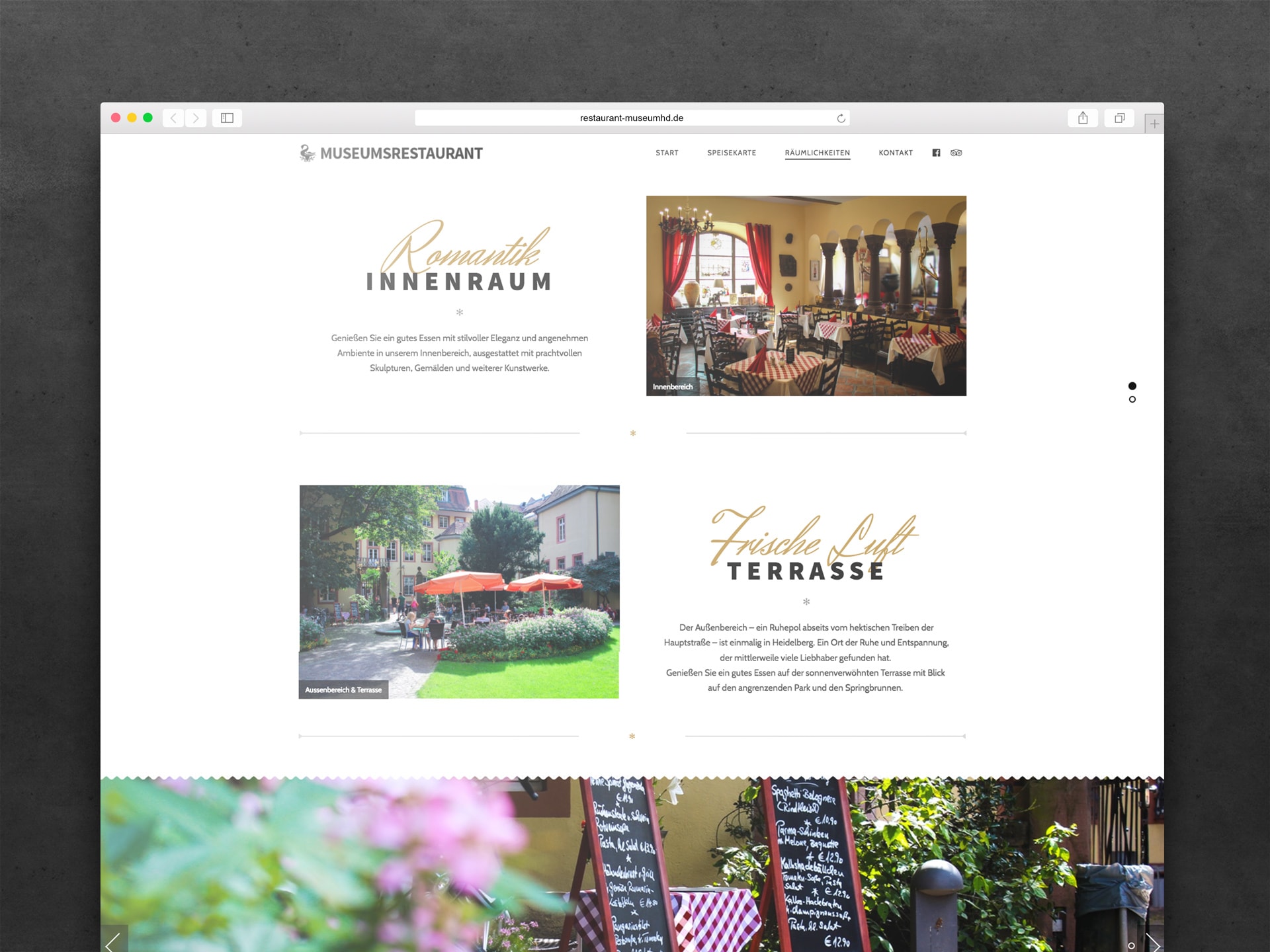
The restaurant is located close to the museum with its outdoor area actually being in the beautiful garden of the museum where people can sit around an old fountain and enjoy the view.
In 2016 the restaurant got a new owner who decided to renew the whole place including their website which was built in the 90’s.